Pharmacie Latreche
Logo design
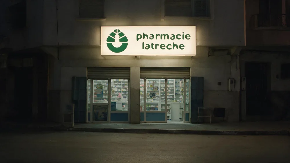
A pharmacy that needed a sign people remember, not one more green cross.
- Client
- Pharmacie Latreche Ibtissem
- Year
- 2026
- Sector
- Pharmacy
- Role
- Logo design
- Delivered
- Primary logo, secondary logo, logo mark, colour, type
A category with no visual memory.
Caduceus, medical typography: every pharmacy borrows the same signs, so none of them is remembered. People remember "the pharmacy", never which one.
A system, not a logo.
Territory rejected
Classic typography and conventional medical lettering.
Rejected not for taste but for function: they signal the category, not the brand. That treatment is correct and legible, and it produces one more pharmacy on a street that already has several.
The guiding idea
One shape, three readings.
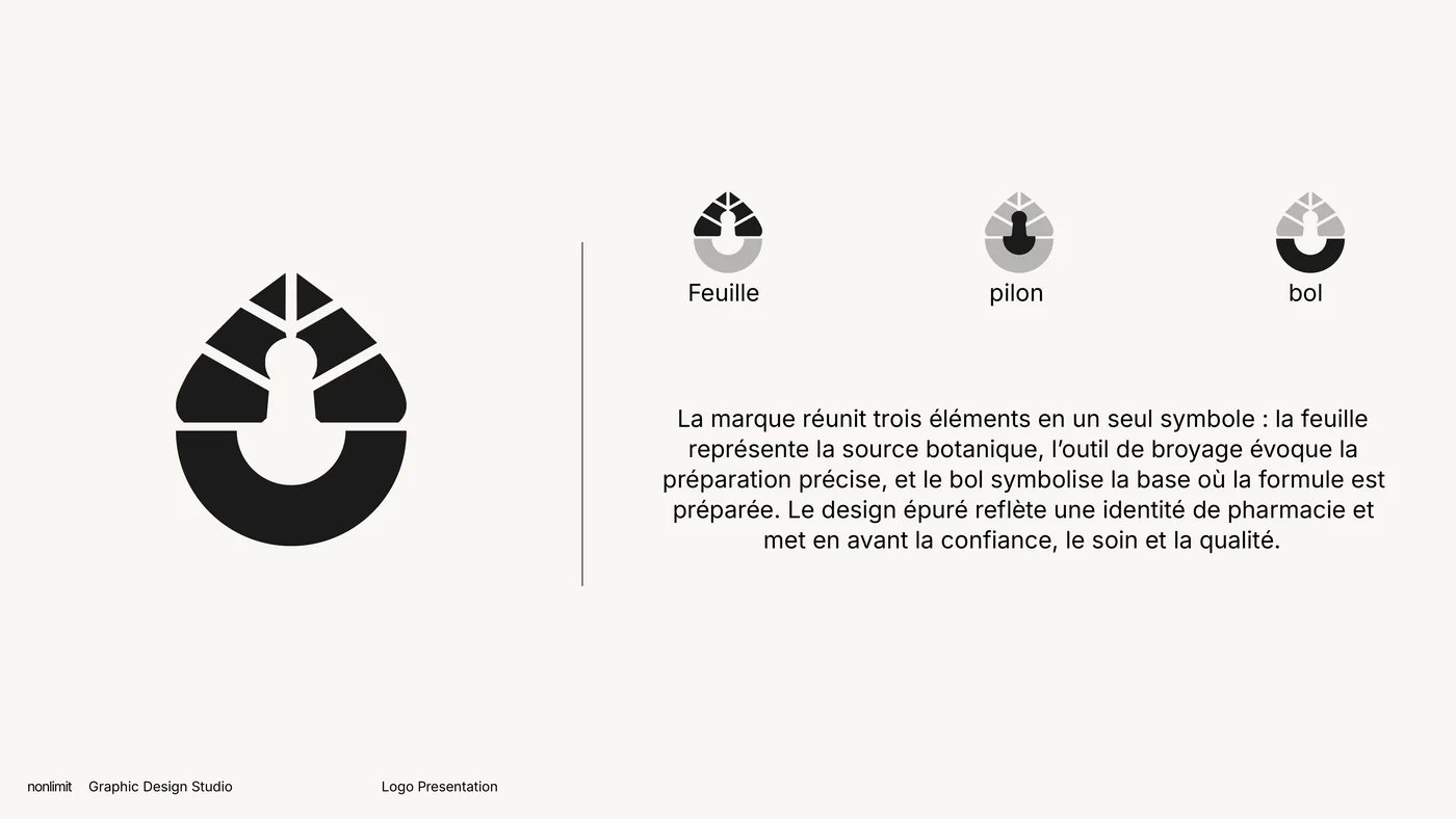
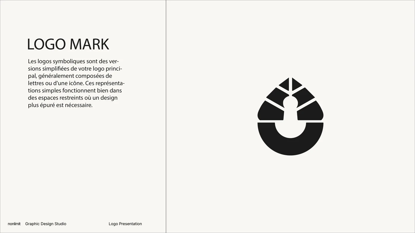
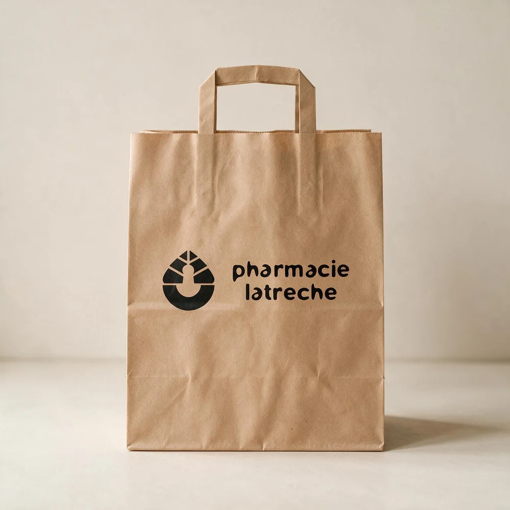
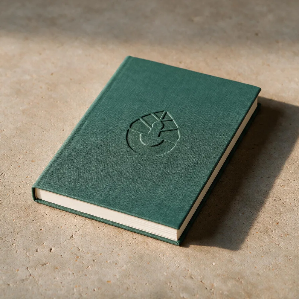
The symbol fuses three signs into a single silhouette: the leaf for care, the pestle and the bowl for the pharmacist's craft. All three held together by one symmetry.
Leaf, pestle, bowl.

The botanical source.
The grinding tool. Precise preparation.
The base where the formula is made.
A clean drawing that reads as a pharmacy and puts trust, care and quality first.
Three versions, one family.
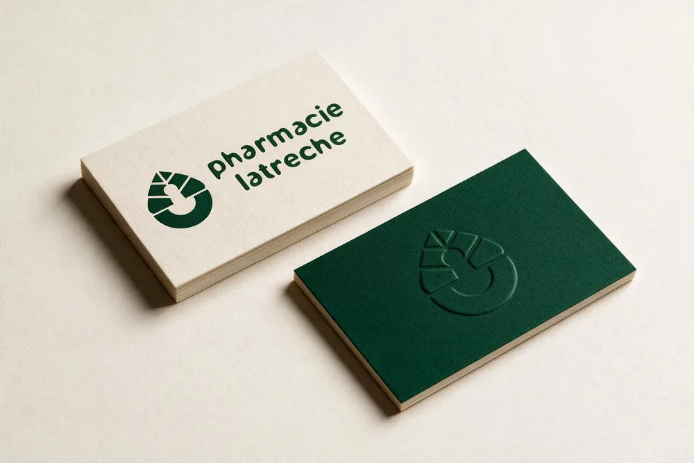
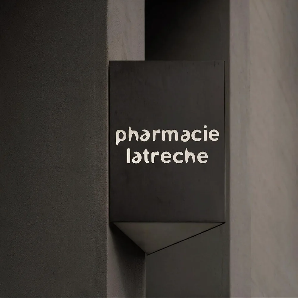
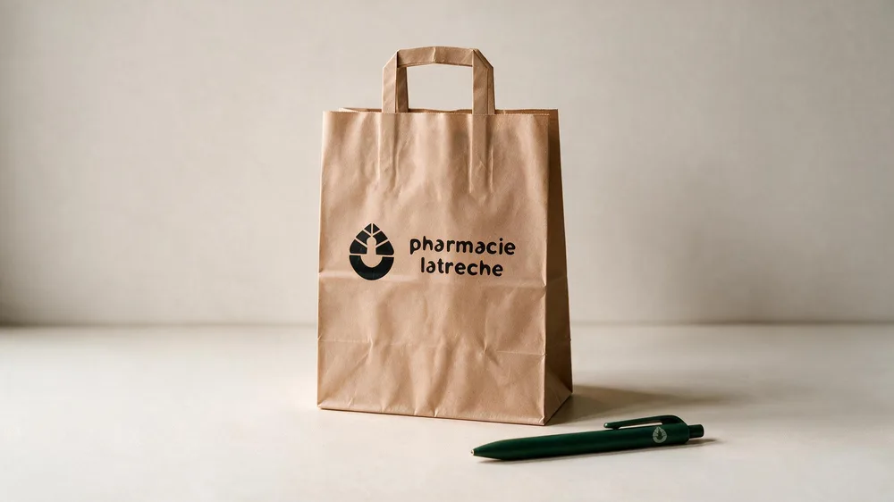
A primary logo for the shop front, a secondary logo for flexible layouts, and the mark alone for small spaces.
Colour
Clean medical blues and aquas, softened by a warm sand. In the applications the mark sits on a deep pine green.

#0187A5
#5FD0C8
#E0F7F3
#BFEDE8
#F6E7BE
#A8DDF0
Typography
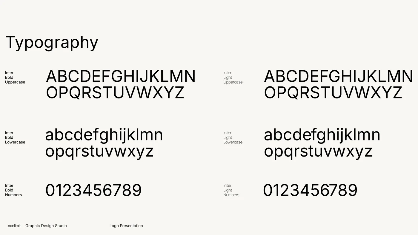
Inter in two weights: Bold for names and headings, Light for information.
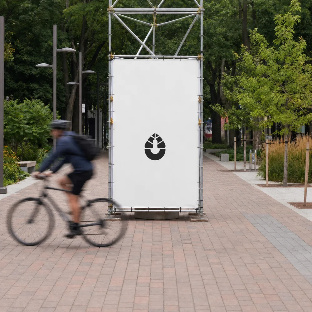
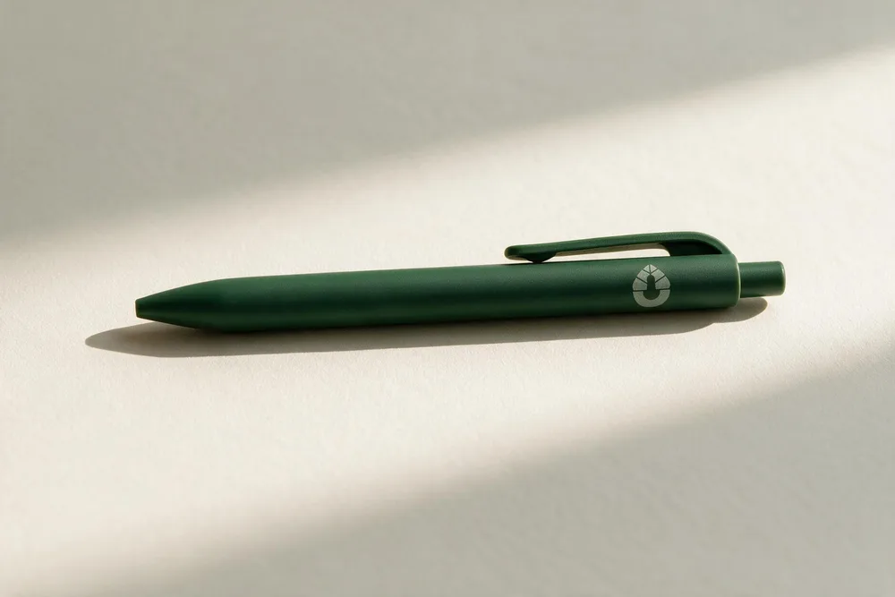
From the sign to the pen.
“Professionalism. Seriousness. Skills. Creativity. Punctuality. Mashallah, tabarak Allah.”