[Case study]

Kiva

Algerian Contemporary.

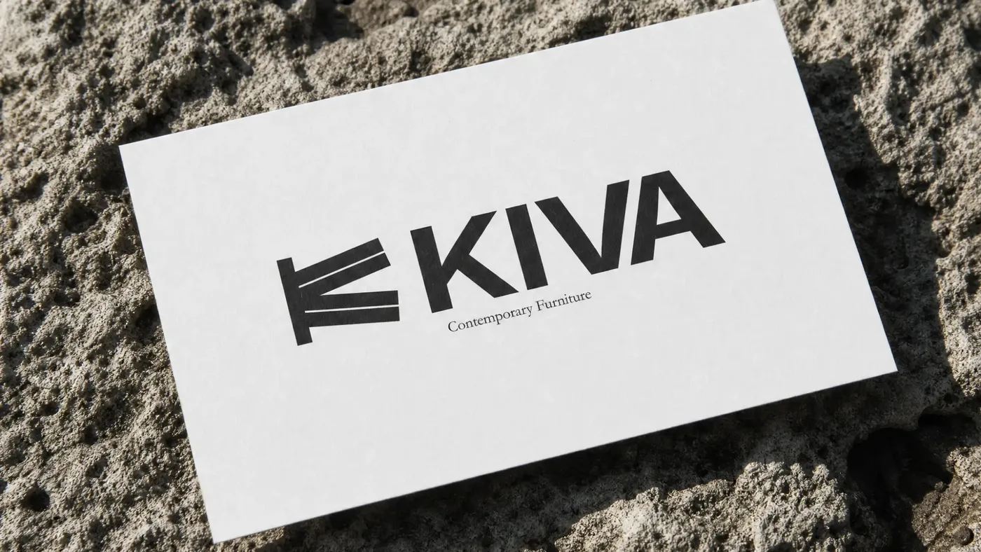
White KIVA business card with the monogram, wordmark and 'Contemporary Furniture', lying on rough stone.
01 Definition

KIVA crafts quiet, geometric furniture for Algerian homes.

Smoked walnut. Soft fabrics. Warm tones. Coffee tables built so every angle is measured, so a living room has somewhere calm to rest.

Client
KIVA
Year
2026
Sector
Contemporary furniture: design, build, retail
Role
Brand strategy, identity, web, art direction
Starting point
Built from zero. No brand existed.
Tagline
Algerian Contemporary.
02 The challenge

You cannot touch a coffee table through a phone.

Furniture is bought with hands. People sit on it, press the corner, run a thumb along the grain, then decide. KIVA had to sell premium furniture to people who would never touch it before paying. From a screen, in a market where an expensive local purchase is a risk most buyers have been trained to avoid.

And there was no company when this started. No name in market, no mark, no language, no customers. A workshop, a belief, and a conviction that Algerian homes deserve furniture with soul, precision and identity.

Two problems underneath that one

/01

Trust has to be manufactured visually.

No showroom, no reputation, no years in business to lean on.

/02

The price has to look inevitable.

Not justified. Inevitable. The moment a buyer starts calculating, the sale is already lost.

Who we were designing for

Affluent Algerian women, buying for family homes.

Not a demographic guessed from a deck. I delivered pieces into these houses and stood in the rooms. I saw the light, the scale, what the furniture would sit next to, what it had to hold its own against.

That is why the art direction looks the way it does. Warm beige, restraint, architectural framing: it is not a mood board. It is what these rooms actually look like, and furniture that fights them does not get bought.

03 The goal

Make the photograph do the work the hand normally does.

Build a brand where the quality is visible before it is explained, so the founder never has to argue for the price in a DM.

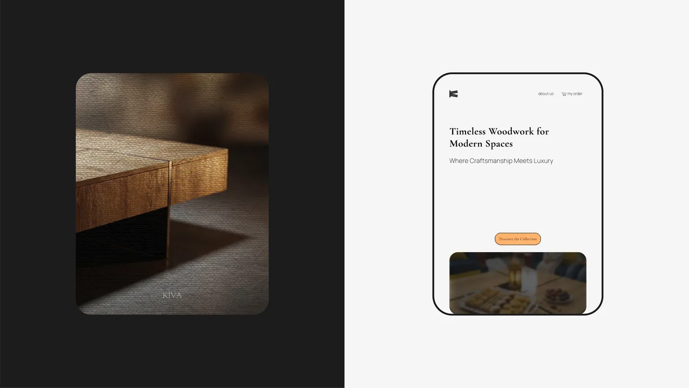
Close-up of the walnut table corner in low light beside the KIVA mobile landing page: 'Timeless Woodwork for Modern Spaces'.
04 Approach

Not a catalogue. An editorial piece.

The instinct in furniture retail is to show more: room sets, styled lifestyle shots, promotional grids, everything at once. That is how you sell volume.

We did the opposite. A strict monochrome palette and intentional negative space. Not a retail catalogue. A minimalist editorial piece that leaves the eye nothing to look at but the product's clean lines.

When there is nothing else in frame, the wood has to hold attention. Which means the work has to actually be good. The restraint is not a style choice; it is a claim about the furniture, and the furniture backs it up.

The brand language followed the same rule. Short lines. No adjectives doing sales work.

/01

Find the words first.

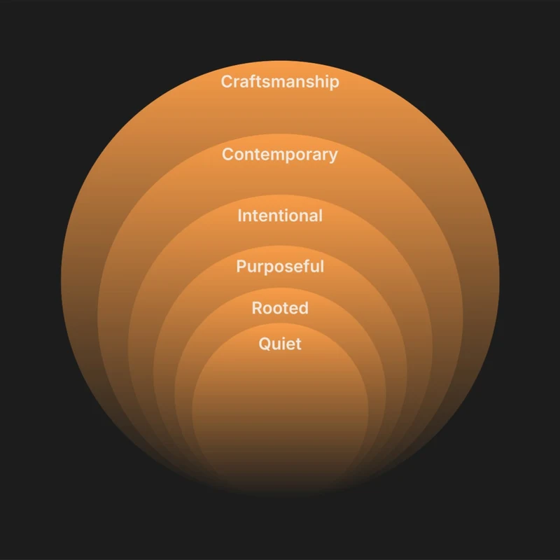
Six territories, ninety words, six kept. The brand had to be calm, crafted, minimal, authentic, high quality and creative. Then one word from each had to carry it.

Calm

  • Serene
  • Peaceful
  • Quiet
  • Still
  • Restful
  • Tranquil
  • Soothing
  • Balanced
  • Gentle
  • Soft
  • Minimal
  • Unhurried
  • Pure
  • Silent
  • Grounded

Crafted

  • Handmade
  • Detailed
  • Refined
  • Precise
  • Intentional
  • Structured
  • Considered
  • Deliberate
  • Measured
  • Clean
  • Composed
  • Ordered
  • Tailored
  • Geometric
  • Honest

Minimal

  • Simple
  • Essential
  • Stripped
  • Purposeful
  • Uncluttered
  • Edited
  • Restrained
  • Raw
  • Sparse
  • Reduced
  • Direct
  • Focused
  • Clear
  • Functional
  • Breathable

Authentic

  • Genuine
  • Local
  • Rooted
  • Cultural
  • Real
  • Grounded
  • Natural
  • Warm
  • Human
  • Familiar
  • Personal
  • Soulful
  • Heritage
  • Earthy
  • Timeless

Quality

  • Excellence
  • Precision
  • Craftsmanship
  • Durability
  • Impeccable
  • Superior
  • Fine
  • Elite
  • Prime
  • High standard
  • Flawless
  • Lasting
  • Solid
  • Reliable
  • Enduring

Creative

  • Artistic
  • Visionary
  • Original
  • Expressive
  • Inspired
  • Inventive
  • Imaginative
  • Thoughtful
  • Resourceful
  • Skilled
  • Talented
  • Innovative
  • Impactful
  • Crafty
  • Contemporary
The six kept words layered as concentric circles: Craftsmanship, Contemporary, Intentional, Purposeful, Rooted, Quiet.
/02

Concept exploration.

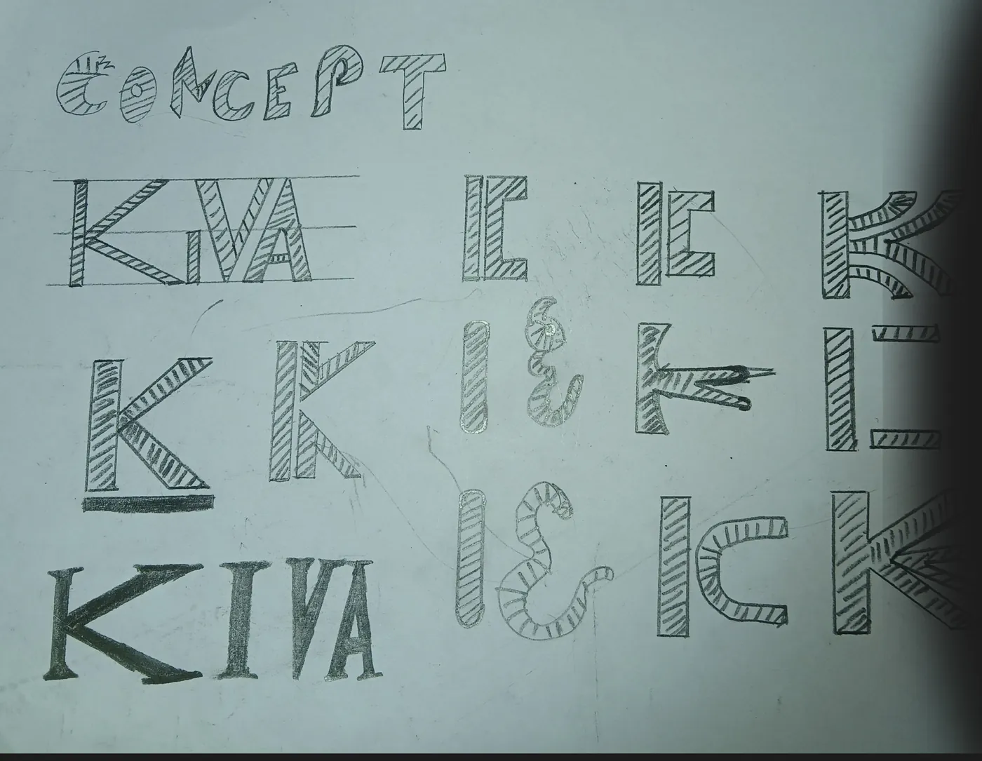
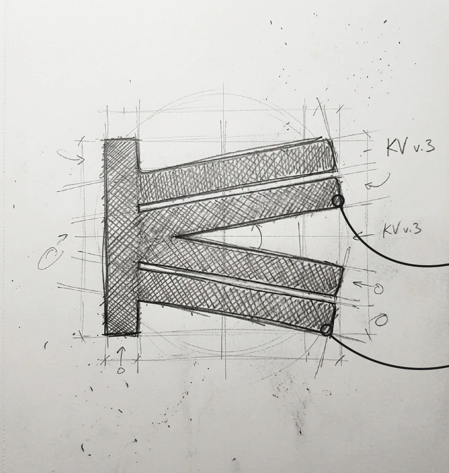
Brainstorming and conceptualizing the core logotype. The goal was to experiment with raw shapes, angles and curves on paper before bringing the concept into the digital workspace.

A pencil sketch page titled 'Concept' with many hatched variations of the letters K, I, V and A: straight, curved and angled.
Close pencil sketch of the KIVA monogram: a vertical stem with two pairs of angled bars, annotated 'KV v.3', with construction circles and guide lines.
/03

Conceptual focus.

K + V

The design concept centers on the seamless integration of K and V. By leveraging shared geometric angles, the V functions as the structural arms of the K, creating a unified monogram that symbolizes synergy and precision.

/04

Construction.

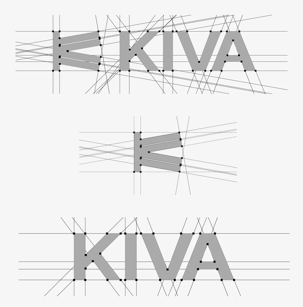
Monogram and wordmark drawn on the same set of angles, so the icon and the name read as one object.

Logo construction drawing: the KIVA monogram and wordmark on a grid of angled guide lines with anchor points.
05 Decisions

Three calls that shaped everything after.

/01

One object, not a catalogue.

A new furniture brand has a choice: show a range and look established, or show one piece and look certain. We chose one.

Everything went into making a single coffee table undeniable. No filler products, no range pages padding out a launch. A new name with one perfect object is more believable than the same name with twenty average ones. And when the buyer cannot touch anything, every bit of attention spent on a second product is attention taken from proving the first.
/02

Empty the frame.

Strict monochrome. Intentional negative space. No styled room sets, no props, no lifestyle clutter.

This is the decision that carries real risk. Remove the context and the object has to hold the image by itself. There is nothing else for the eye to forgive a weak joint or a lazy proportion. It only works if the furniture is genuinely good. Choosing it was a statement that it is.

A catalogue asks to be browsed and closed. Editorial asks to be studied. Studying is the exact behaviour required from someone about to spend real money on something they have never touched.

/03

Hand over a system, not a folder of files.

The work included a content system the founder could run without me: keywords, scripts, product and social structure, built in Notion.

Most brand projects end when the logo is delivered and decay from there, because the client cannot keep the language consistent alone. KIVA now runs its own ads and reels in the brand's voice. The system is why the brand is still coherent months after handover.

06 Solution

A brand quiet enough to let the wood speak.

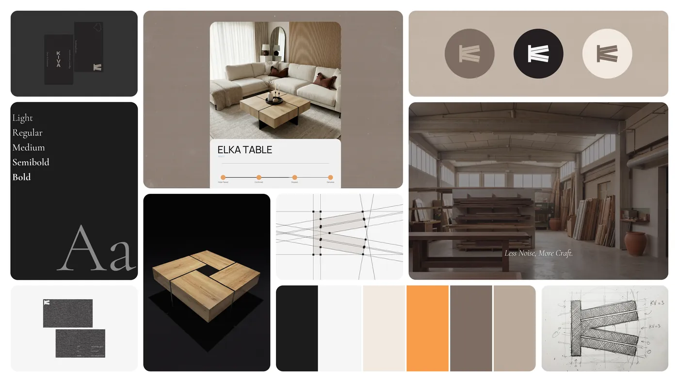
A monogram built from two letters, six colours taken from the rooms, and two typefaces: one for the voice, one for the facts.

KIVA identity overview: business cards, type specimen, the ELKA table product card, monogram roundels, the workshop, the square walnut table, the palette and the monogram sketch.

Colour

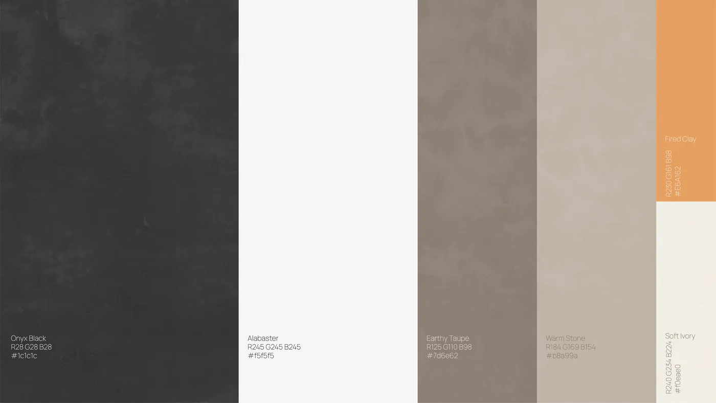
Onyx and Alabaster do the structural work. Taupe and Stone come from wood, plaster and linen. Fired Clay is the only accent: buttons, order steps, one card.

KIVA palette board with textured swatches: Onyx Black, Alabaster, Earthy Taupe, Warm Stone, Fired Clay and Soft Ivory.
  • Onyx Black

    #1C1C1C
    R28 G28 B28

  • Alabaster

    #F5F5F5
    R245 G245 B245

  • Earthy Taupe

    #7D6E62
    R125 G110 B98

  • Warm Stone

    #B8A99A
    R184 G169 B154

  • Fired Clay

    #E6A162
    R230 G161 B98

  • Soft Ivory

    #F0EAE0
    R240 G234 B224

Typography

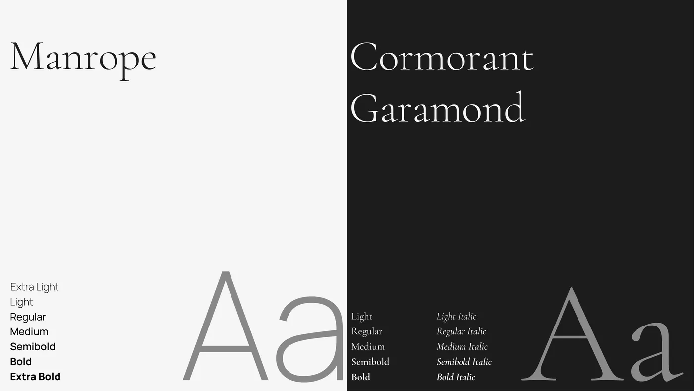
Cormorant Garamond carries the voice: headlines, lines of copy, anything that should feel written by hand. Manrope carries the facts: labels, prices, order steps.

Type specimen board: Manrope in weights from Extra Light to Extra Bold on alabaster, Cormorant Garamond from Light to Bold Italic on onyx.

Voice

Short lines. No adjectives doing sales work.

  • Brand lineBorn in Algeria. Built to last. Furniture that breathes.
  • Sign-offEnjoy the Calm.
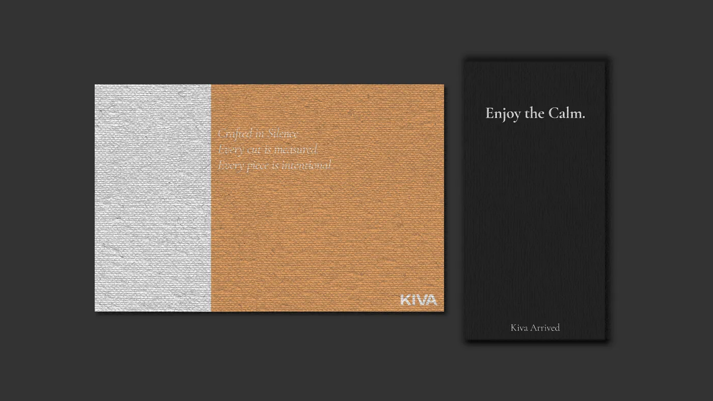
  • Delivery cardCrafted in Silence. Every cut is measured. Every piece is intentional.
  • WorkshopLess Noise, More Craft.
  • BrochureBorn from Algerian soil.

In use

Landing page, brochure, cards and product pages. Every touchpoint holds the same restraint.

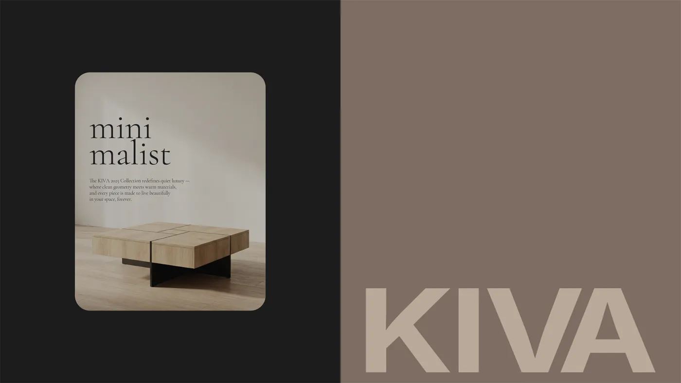
KIVA editorial card with a square walnut coffee table beside the KIVA wordmark on earthy taupe.
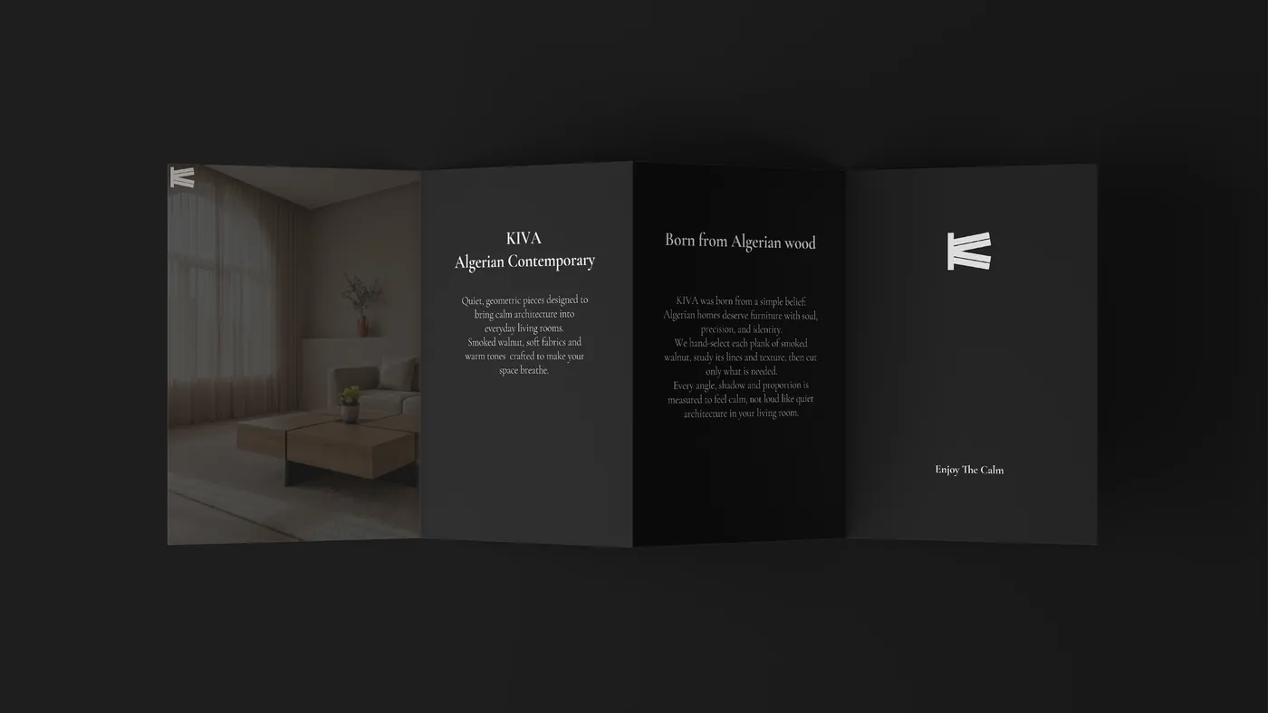
Open four-panel dark brochure: a living room, 'KIVA Algerian Contemporary', 'Born from Algerian wood' and the monogram with 'Enjoy The Calm'.
Two printed cards: a Fired Clay card reading 'Crafted in Silence. Every cut is measured. Every piece is intentional.' and a black card reading 'Enjoy the Calm. Kiva Arrived'. A dark KIVA card balanced on its corner on a concrete floor in a hard beam of light.
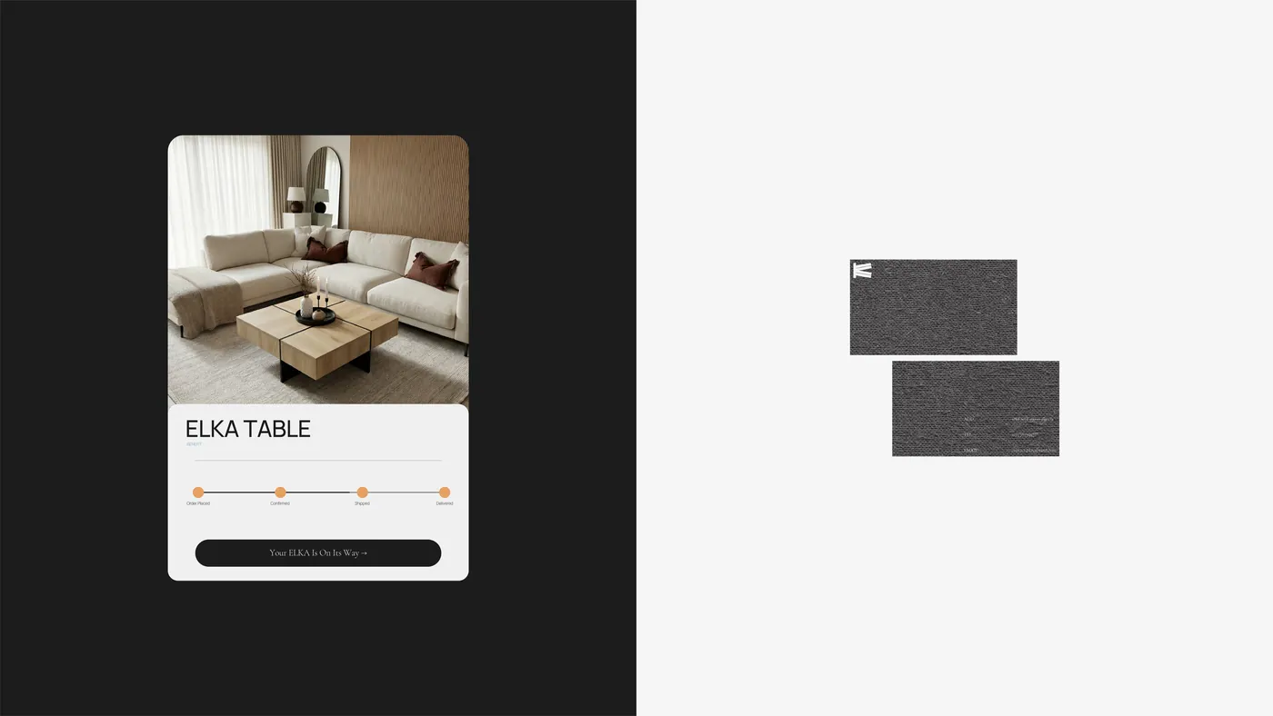
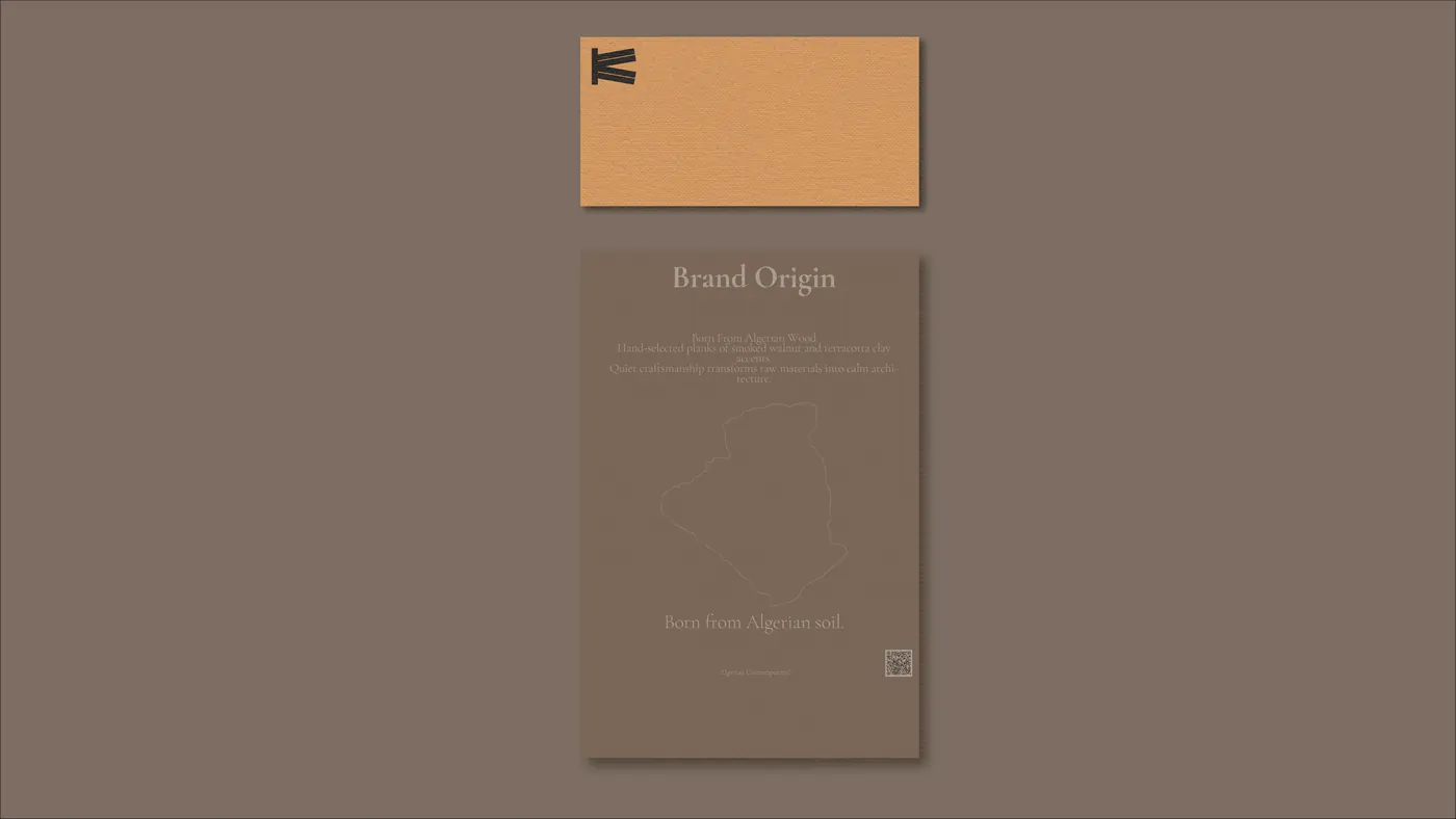
ELKA TABLE order tracking card with a living room photo and order steps, next to two textured charcoal business cards. Fired Clay card with the monogram above a taupe 'Brand Origin' leaflet showing an outline of Algeria and the line 'Born from Algerian soil.'
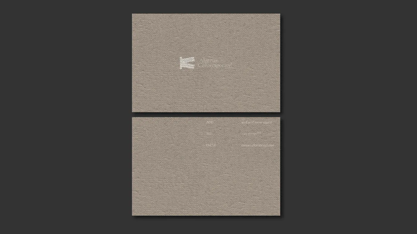
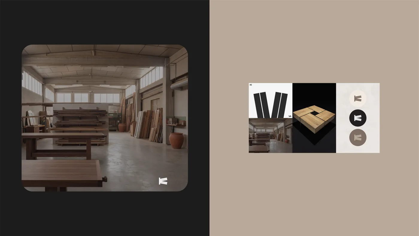
Front and back of a textured taupe card with the monogram and 'Algerian Contemporary!'. The KIVA workshop with timber and workbenches, beside a grid of brand tiles: the split K and V, the square table and monogram roundels.
They said

“Honestly, I didn't expect this level of clarity. KIVA now has a strong position in the market. People understand who we are without me having to explain it. The strategy made all the difference.”

YouppiFounder · KIVA